Assets Look Dev
As the Look Development Lead, I am in charge of the main assets and characters. The directors did research of typical woods used in Indonesian furniture, and found out Merbau (Kwila) and Teak are two of them. I was in charge of creating those two woods in Substance Designer, to use them as base materials in Substance Painter.
Base Materials
Teak Wood
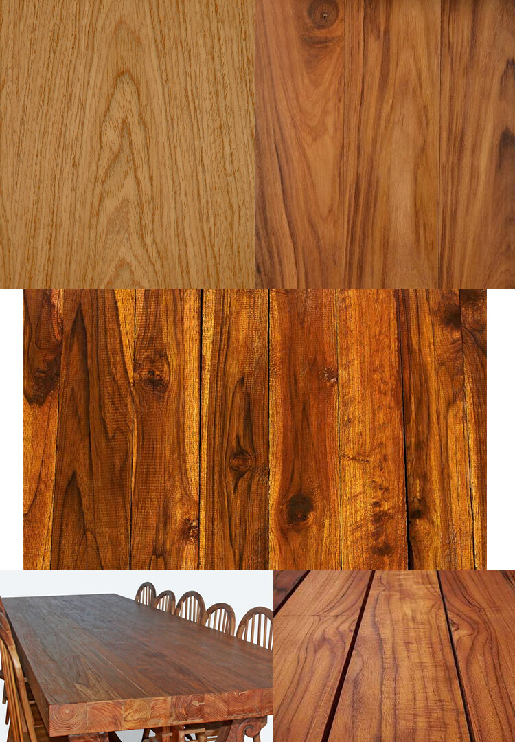
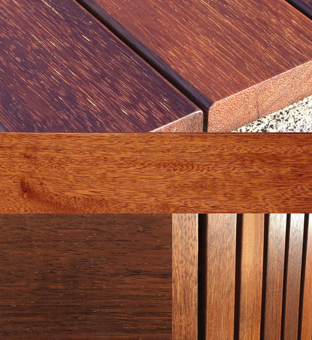
Before starting a material, I like to gather all possible reference and create a collage. The first material I worked on was the Teak Wood:
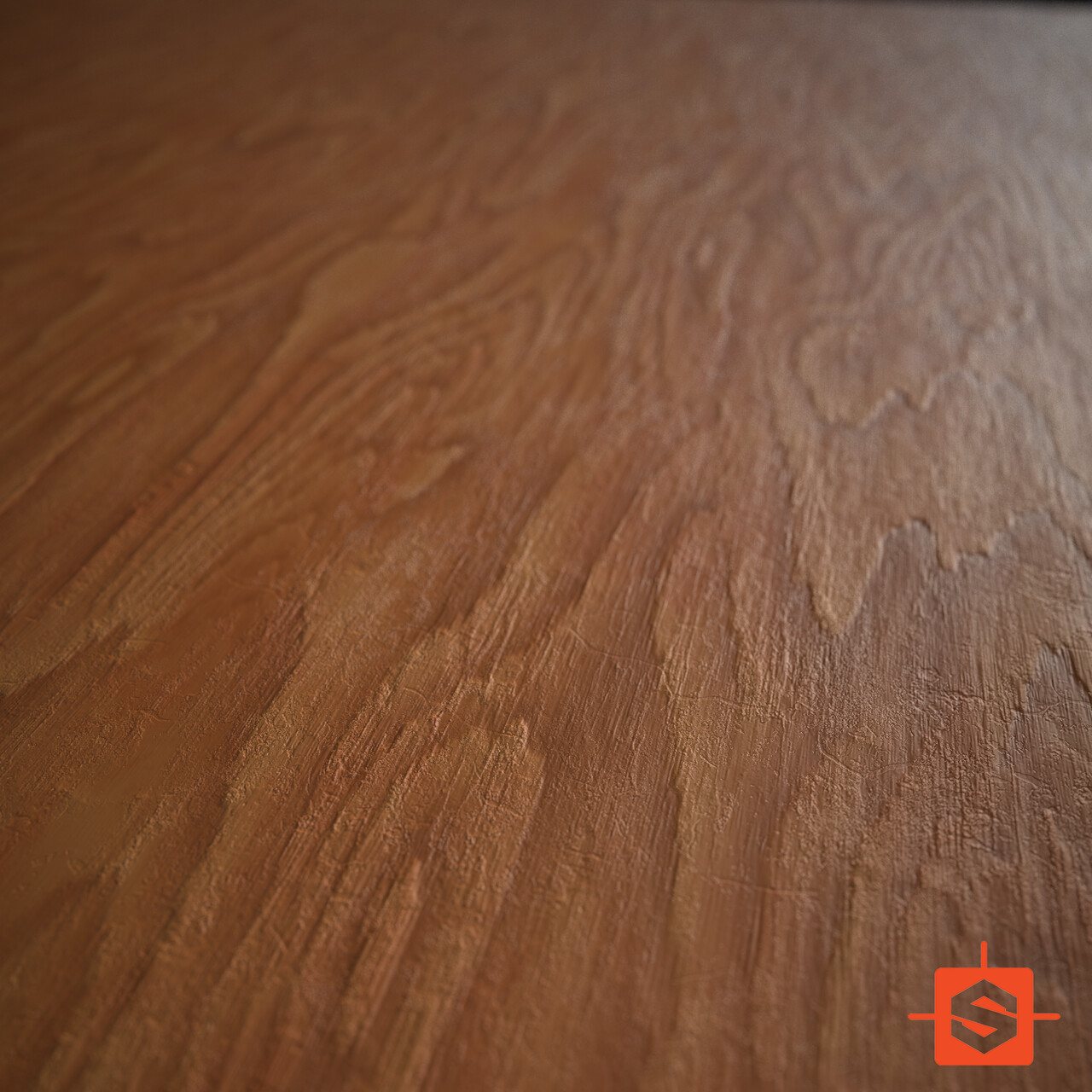
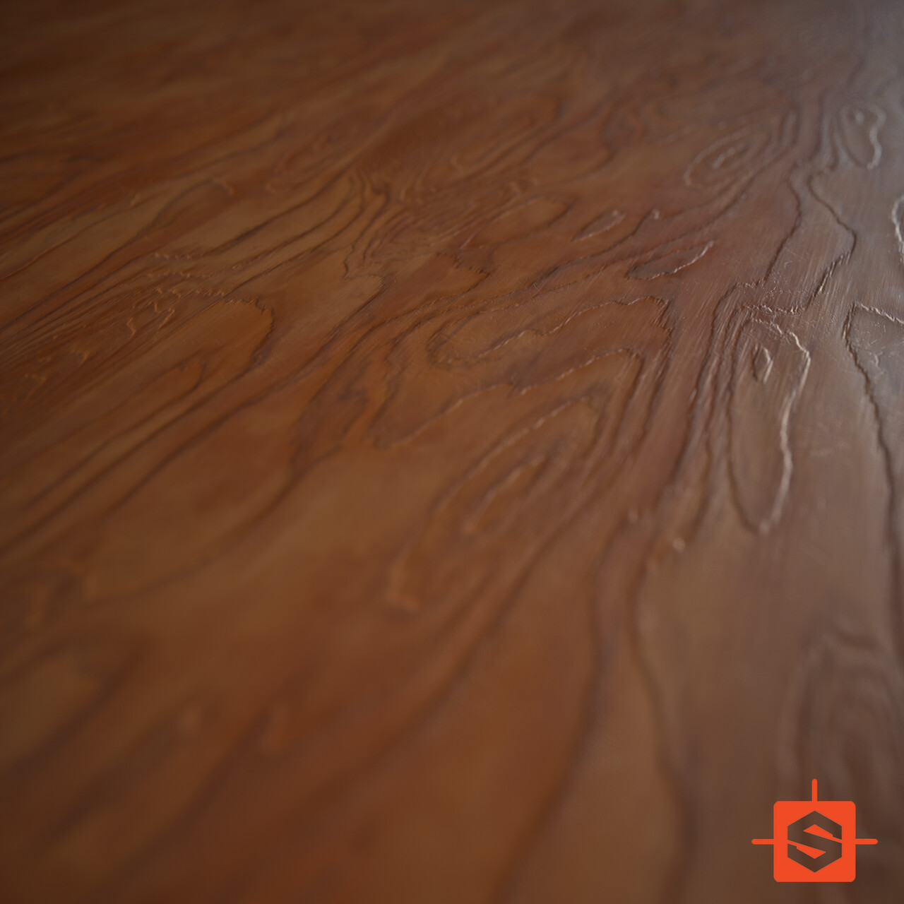
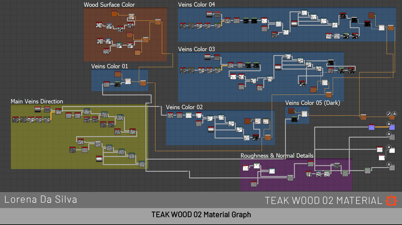
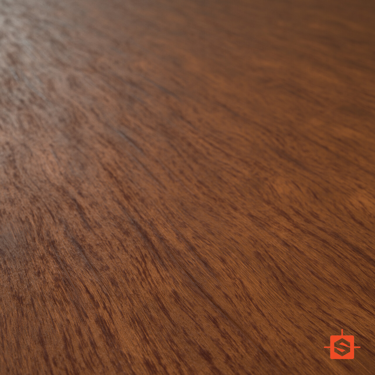
These are the final outcomes of the Teak Woods. I made two: the second one is a small variation of the first one.
I posted the Teak Wood renders on my art Instagram, and @Substance3d reposted them! I was so happy that they noticed my material! :D
Merbau (Kwila) Wood
For the Merbau/Kwila, I also gathered some reference and made a collage:
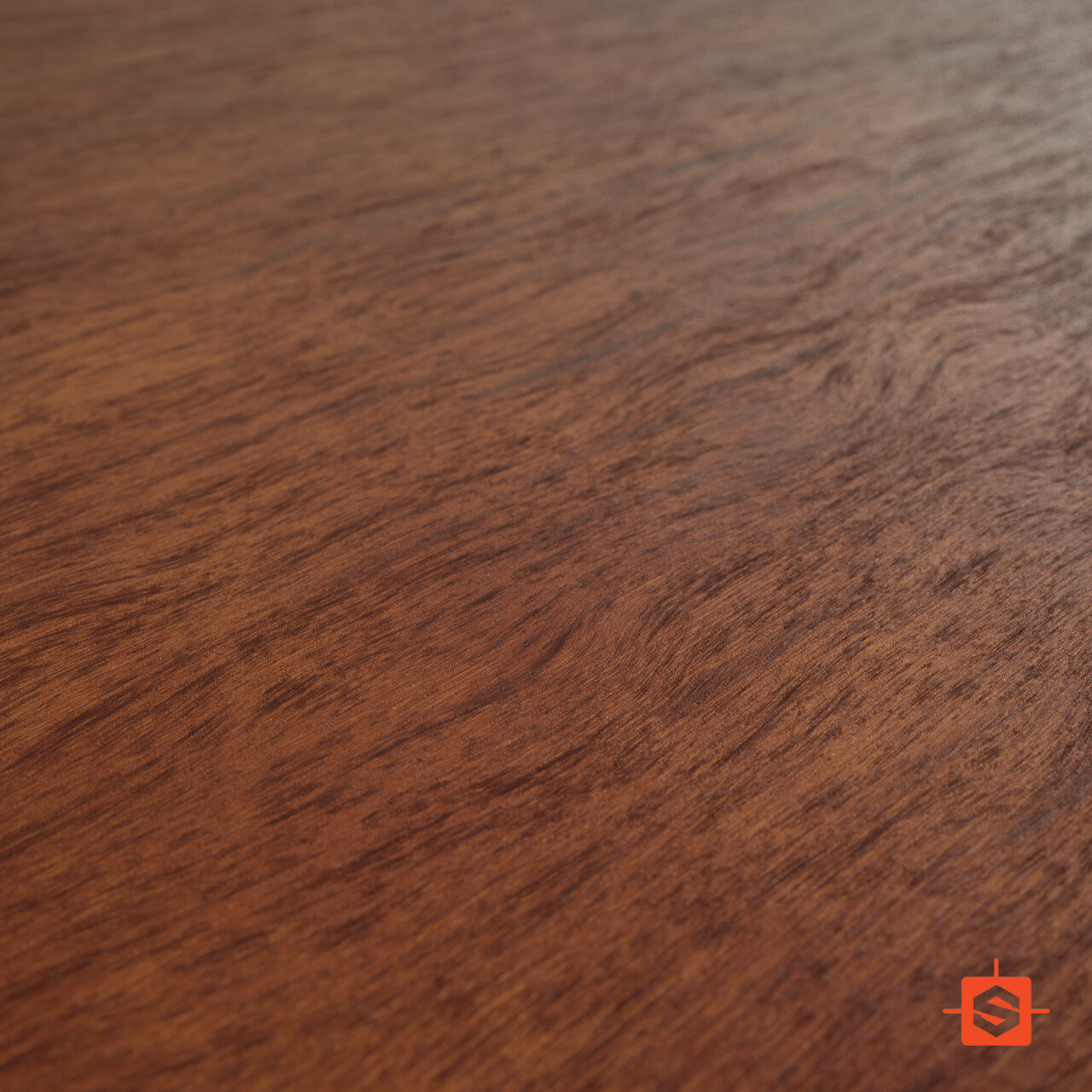
The renders from Substance Designer came out looking like this:
I posted the Merbau Wood renders on my art Instagram, and @Substance3d reposted them again!
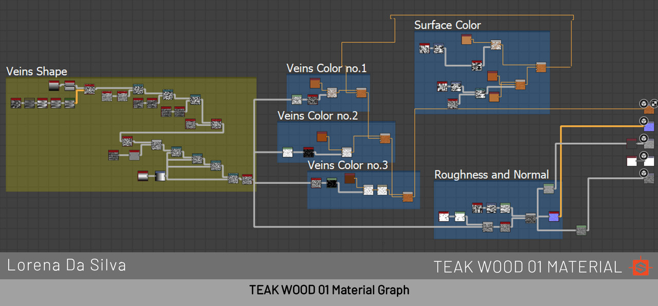
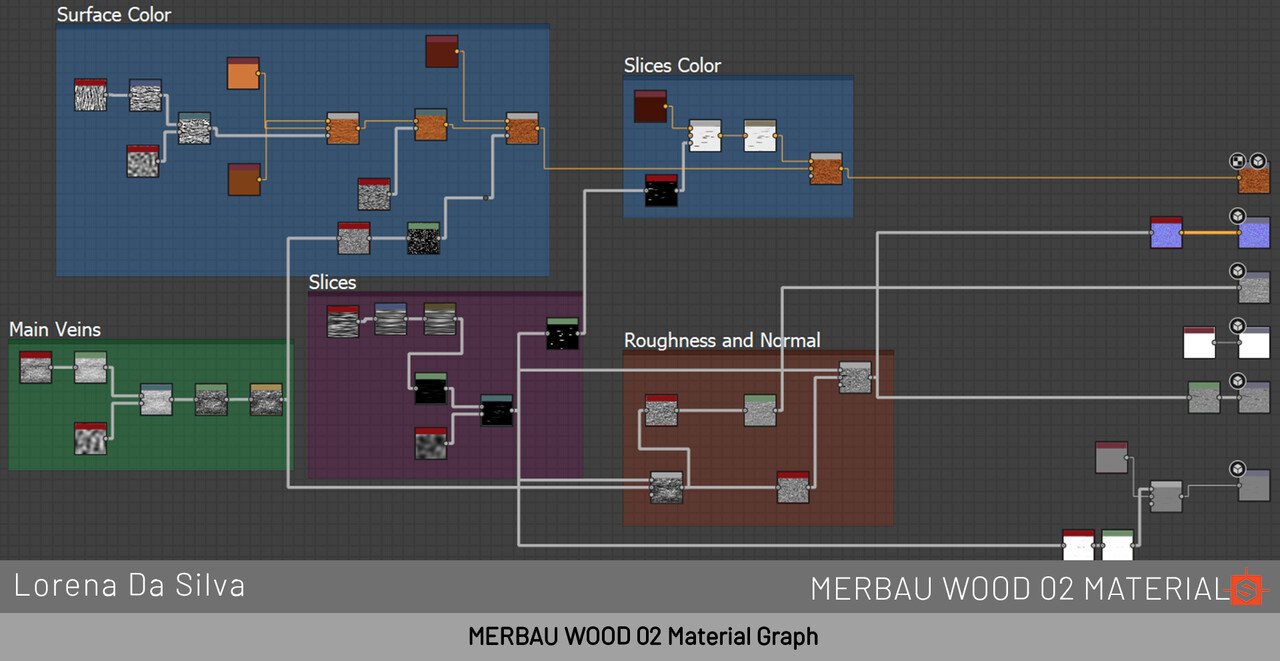
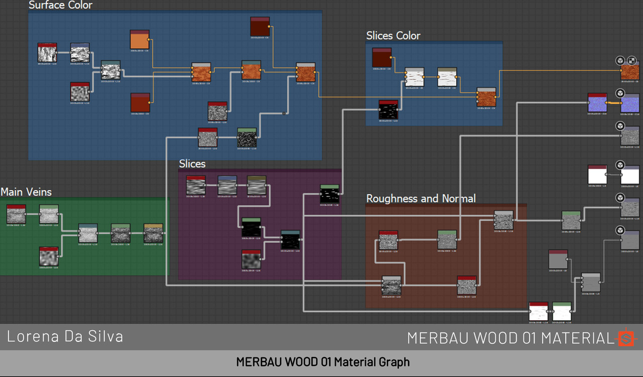
This is how my node graph looks like:
One of the nodes that really helped me a lot and was using for the first time was the "Highpass Grayscale". It helped me sharpen those line details/veins from the wood.
Assets Texturing & Look Dev
Workbench
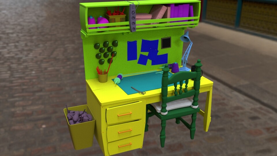
The main asset from the film is the Workbench. A lot happens around it or on top of it, so I had to make sure this workbench looked fantastic. The 3D model of the workbench was a teamwork, since more than one person modeled at least one or two assets that are part of it. This is how I organized the shading groups:
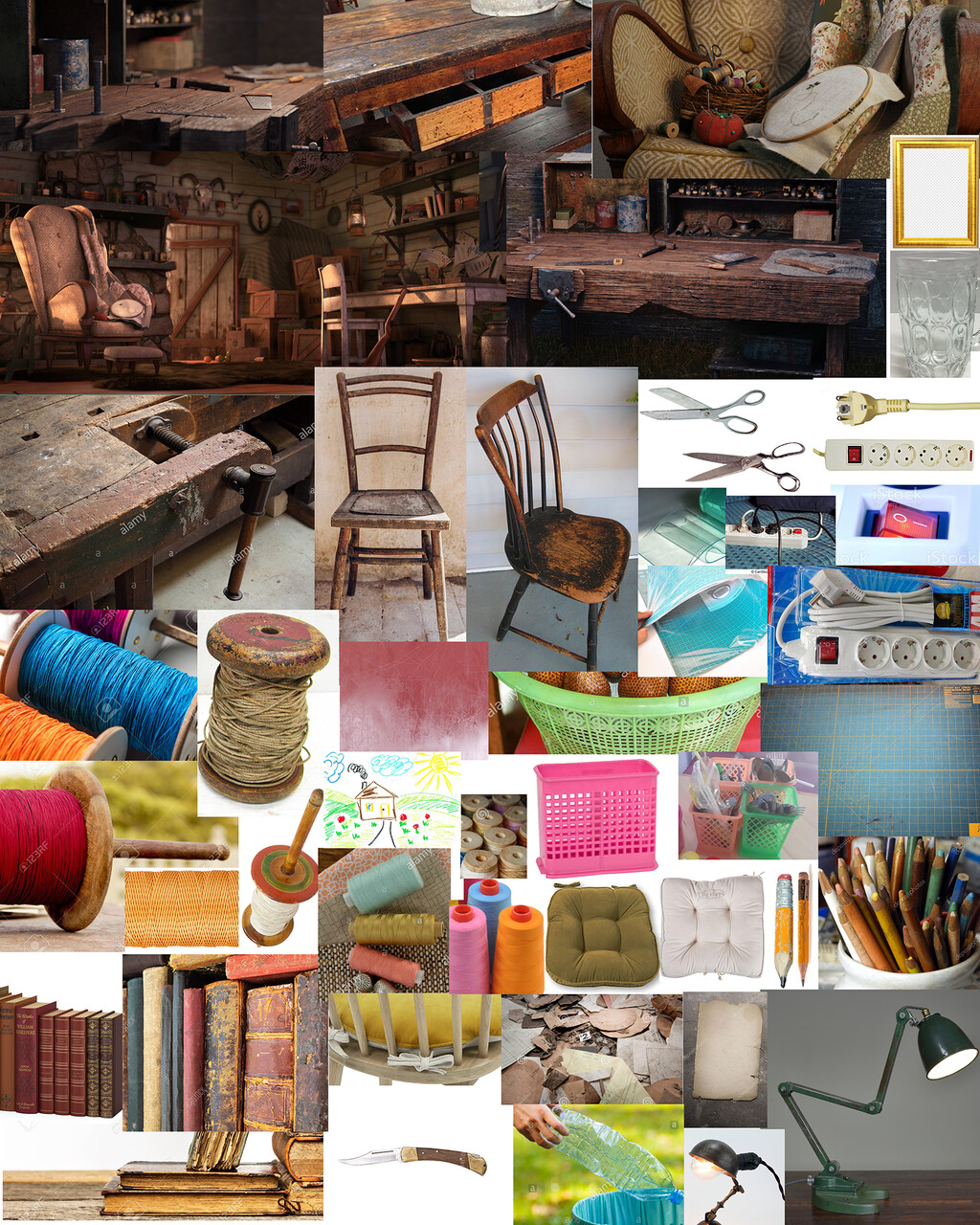
As usual, I create my collage of reference pictures for texturing:
I used the Teak Wood for the wood of the table, and added some tint to some of the planks. The photograph drawing was made by Alyssa Lee. I always work with real life reference, but texturing a bit stylized than realistic was a challenge to me. I learned how to simplify some of the details so it wouldn't look too realistic, while working with accurate settings. I am also learning how to work with some art direction from the directors, since they asked for some desaturated colors, since the kites are already too colorful.
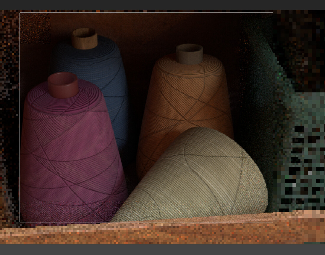
One of the things that took me a long time was creating the masks for the wood, so the wood wouldn't be in the same direction or show the same veins. Another thing that took me some time was creating the thread, that triangle overlapping shape they have in the references collage. I manually masked triangles, so that way some triangle masks had the thread going in the opposite direction. Since it's a background asset, I only used a normal map, to fake the thread.
Final result of the workbench!!:
Small Cabinet
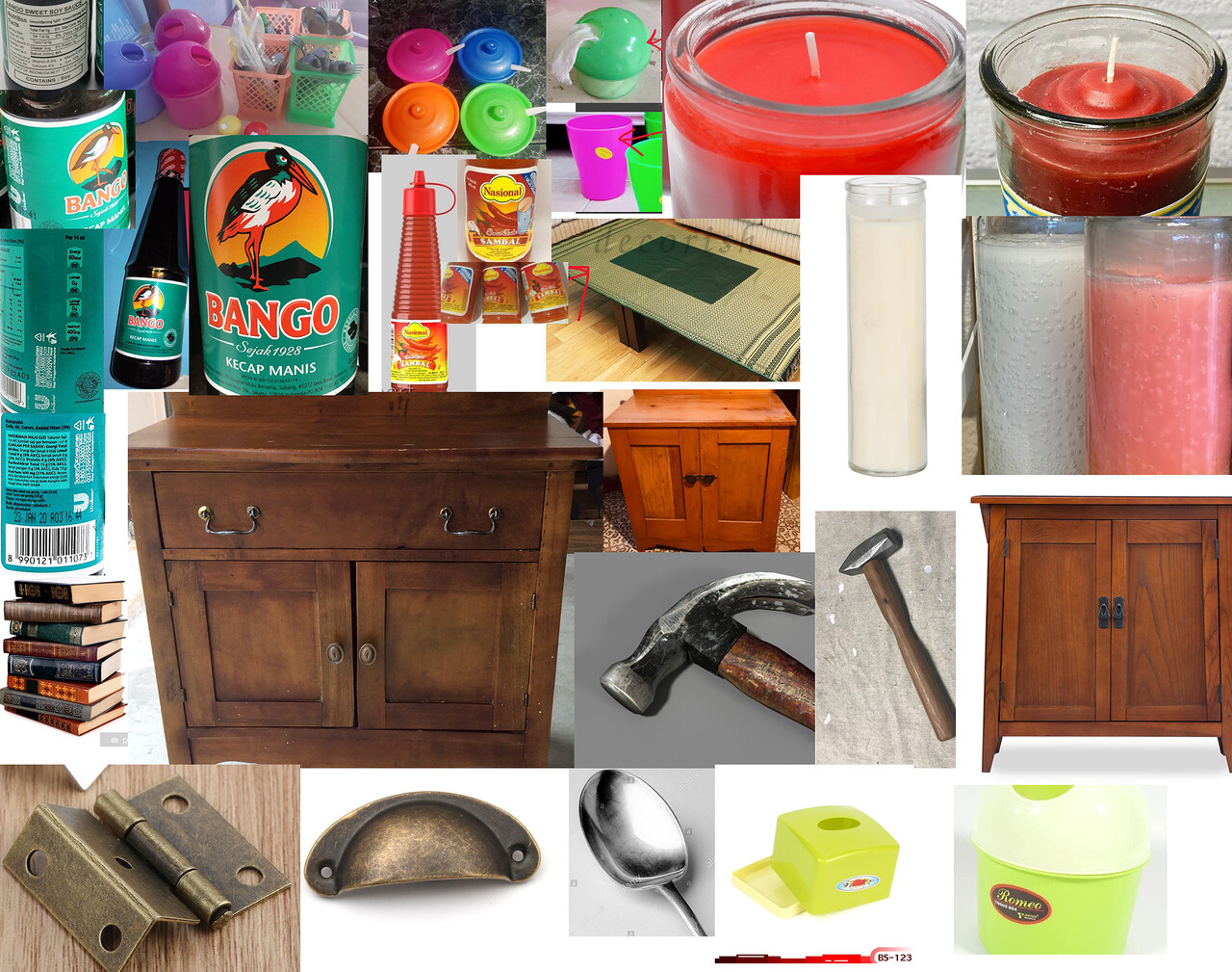
The small cabinet sits next to the workbench, so I used a different wood, like the Merbau Wood. My references collage:
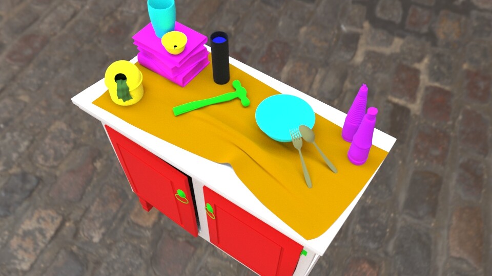
Separation of shading groups:
I created some spoof labels for the sauces, to add our own flavor in the film. To create the spoofs, I used Photoshop to create a Base Color map that was modified in Painter and finalized there.
Some of the resources I used while I shaded the tablecloth of the cabinet were for the Sheen attribute in the aiStandardSurface:
- http://mographplus.com/115-how-to-create-silk-cotton-velvet-and-other-fabric-shaders-in-arnold-for-maya/
- https://docs.arnoldrenderer.com/display/A5AFMUG/Sheen
To make it more real, I used an opacity map for the thread holes.
Garage Loose Items
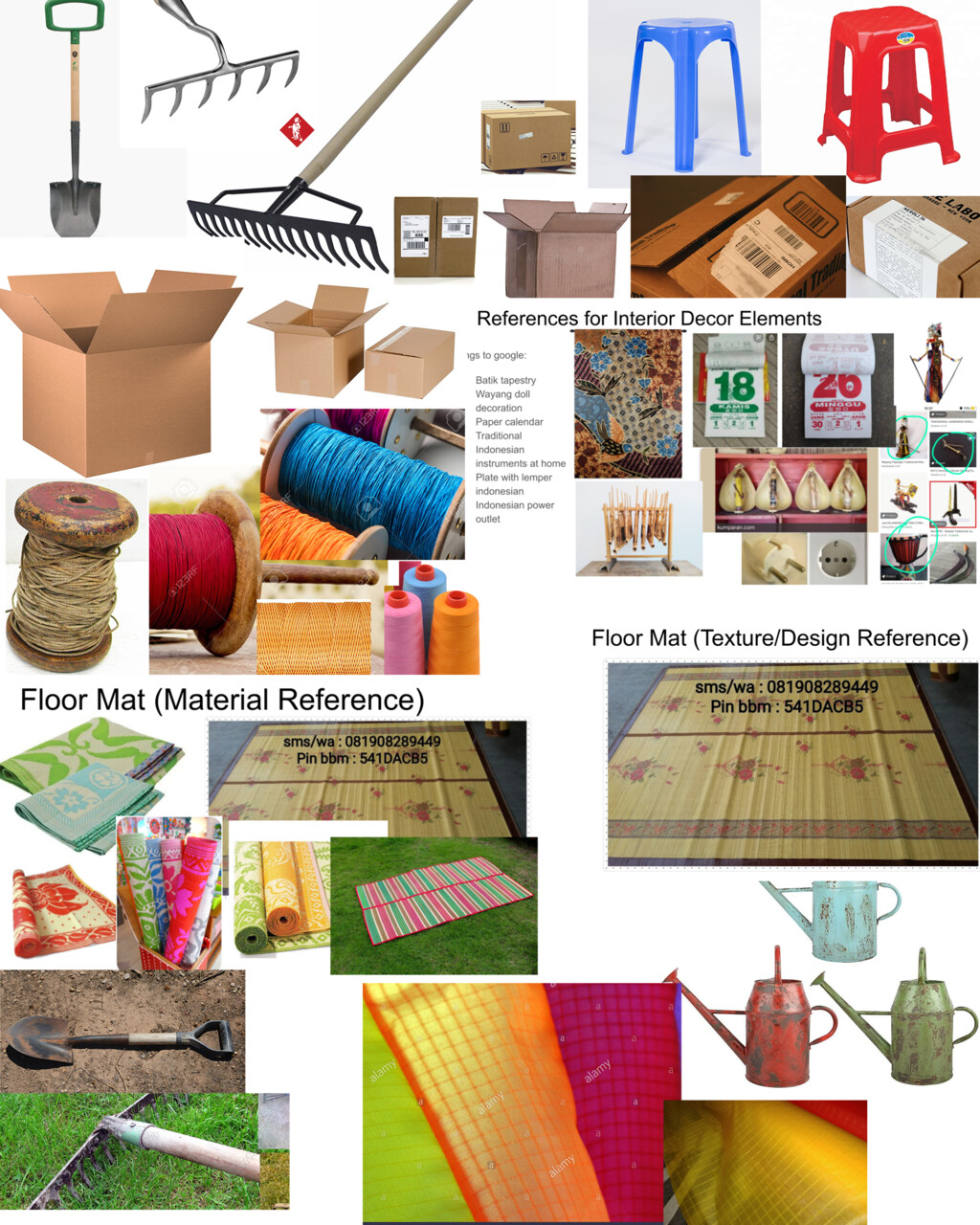
These items are mostly on the background, but I had so much fun texturing the cardboard boxes :D Here are my references and then the final lookdev.
